The Psychology of Color Theory: Beyond the Basic Wheel
Have you ever walked into a room and immediately felt a sense of calm, or perhaps a sudden burst of energy? It’s not just the decor or the lighting; it’s the power of color. While we all learned about the basic color wheel in school, the psychology of color goes much deeper than just matching complementary shades. It is a complex language that speaks directly to our subconscious, influencing our moods, decisions, and even our physical well-being.
Today, we’re going to explore how color theory transcends simple aesthetics. We’ll look at why certain colors trigger specific emotions and how you can use this knowledge to create spaces and designs that truly resonate on a human level.
Why Color Perception is More Than Visual
Color isn't just something we see; it's something we experience. Our brains process color through a combination of biological evolution and cultural conditioning. For example, why do we often associate red with danger or excitement? It might be because red is the color of blood and fire—elements that required our ancestors' immediate attention for survival.
The Biological Connection
Beyond our survival instincts, light and color affect our circadian rhythms. Blue light, which mimics the bright midday sky, keeps us alert by suppressing melatonin. This is why looking at your phone late at night can disrupt your sleep. On the other hand, warm amber tones signal the end of the day, helping our bodies relax. Understanding these biological responses allows us to design environments that support our natural biological clocks.

Cultural Nuances in Color
It is fascinating to realize that color meanings aren't universal. While many Western cultures see white as a symbol of purity and weddings, in many Eastern cultures, it is traditionally associated with mourning. Similarly, yellow can represent joy in one culture and cowardice in another. When we design for a global audience, we must look beyond the standard color wheel and respect these deep-seated cultural associations.
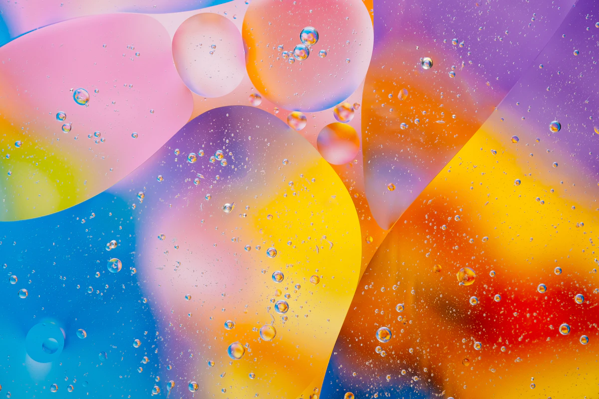
The Emotional Language of the Palette
Colors have the unique ability to bypass our logical mind and strike an emotional chord. Designers and marketers have used this for decades to influence how we feel about a brand or a product. But you don't need to be a professional to use these "hacks" in your daily life or your own creative projects.
| Color Group | Primary Emotion | Typical Application |
|---|---|---|
| Deep Blues | Trust, Stability, Calm | Banking and Healthcare branding |
| Vibrant Oranges | Energy, Playfulness, Friendly | Tech startups and creative agencies |
| Earth Tones | Reliability, Nature, Comfort | Organic products and interior design |
| Muted Purples | Luxury, Wisdom, Mystery | Premium skincare and high-end services |
Context is Everything
The psychology of a color can change entirely depending on its context. A bright red might feel aggressive in a doctor's office but perfectly appetizing in a fast-food restaurant. The surrounding colors, the texture of the material, and even the amount of natural light can shift the psychological impact. This is why choosing a palette is about more than just picking one "hero" color; it’s about creating a harmonious ecosystem of shades.
Practical Ways to Apply Color Psychology
So, how can you use this in your world? If you're designing a workspace, consider incorporating greens and blues to enhance focus and reduce stress. If you're creating a social space, warm tones like peach or soft yellow can encourage conversation and a sense of belonging. The key is to start with the "feeling" you want to evoke, rather than the visual trend of the moment.
If you're interested in diving deeper into how professionals choose their palettes, you might want to check out some interactive tools that let you experiment with these psychological principles.
A New Way of Seeing
To wrap things up, color theory is a powerful tool that bridges the gap between art and science. By moving beyond the basic wheel, we can begin to see color as a functional element of design that impacts our mental health, our productivity, and our connection to others. Next time you pick a color—whether it's for a wall, a website, or an outfit—take a moment to ask yourself: "What story am I telling, and how do I want people to feel?"
Quick Takeaways
• Color perception is influenced by both biology and culture.
• Blue light impacts our alertness, while warm tones help us wind down.
• Context and saturation are just as important as the hue itself.
• Always consider the cultural background of your audience when selecting palettes.
Thank you for exploring the deep world of color psychology with me. Start noticing the colors around you today—you might be surprised by how much they've been trying to tell you all along!
