Have you ever walked into a room or opened a website and immediately felt a sense of calm, or perhaps a sudden burst of energy? This isn't a coincidence. It is the result of carefully orchestrated color choices designed to influence your subconscious mind. In the world of visual communication, color is often the first thing we perceive—well before we read a single word or recognize a specific shape.
The Seven-Second Window
Research suggests that we form a first impression within just seven seconds of encountering something new. In that fleeting window, up to 90% of our snap judgment is based on color alone. Understanding the psychology of hue is not just for artists; it is a vital tool for anyone looking to project authority, build trust, or spark curiosity.
The Biological Connection
Our brains are hardwired to respond to different wavelengths of light. For example, long-wavelength colors like red are perceived as stimulating, while shorter wavelengths like blue tend to be more soothing. By mastering these biological triggers, you can strategically guide how others perceive your personal brand or your business environment.
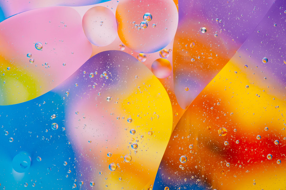
Decoding the Emotional Palette
Every color carries its own emotional weight and cultural baggage. Choosing the right shade means aligning your visual output with the message you want to send. Let's look at how specific hues function in our daily lives.
Deep Blue: Trust & Stability
Blue is the most universally liked color. it signifies reliability, intelligence, and tranquility. This is why it is the go-to choice for financial institutions and tech companies looking to build long-term relationships.
Energetic Red: Passion & Action
Red demands attention. It increases the heart rate and creates a sense of urgency. It is perfect for calls to action or brands that want to showcase power and excitement.
Natural Green: Growth & Health
Green is the color of the natural world. It represents balance, renewal, and prosperity. It is highly effective for wellness brands and sustainable initiatives.
When selecting a palette, it is important to consider the "context" of the color. A bright neon yellow might work for a youth-oriented creative agency, but it would likely feel out of place for a legal firm. You can explore more about color harmonies and pairings at Adobe Color Explore to see how professional designers balance these emotions.
Strategic Application in Branding and Business
How do you translate these psychological principles into a concrete strategy? The key is consistency and contrast. While your primary color sets the mood, your accent colors drive behavior. Using a high-contrast accent color for important information ensures that your most vital points are never missed.
Industry-Specific Color Mapping
| Industry | Primary Color | Psychological Effect | Best Used For |
|---|---|---|---|
| Finance & Law | Navy Blue | Authority & Security | Building client trust |
| Health & Wellness | Soft Green/Teal | Healing & Calm | Stress reduction |
| Luxury Goods | Black & Gold | Exclusivity & Elegance | High-end positioning |
| E-commerce | Orange/Red | Urgency & Joy | Sales and promotions |

Small Changes, Big Impact
You don't need to undergo a complete makeover to benefit from color theory. Even small adjustments, such as changing the color of your presentation slides or your email signature, can subtly shift the way you are perceived. The goal is to create a visual "vibe" that resonates with your intended audience's expectations.
Conclusion: Crafting Your Visual Identity
Key Takeaways for Your Strategy
1. **Know Your Audience:** Before picking a color, identify the primary emotion you want your audience to feel.
2. **Test the Contrast:** Ensure your text is always legible and your key elements stand out through strategic contrast.
3. **Cultural Context:** Remember that color meanings can vary across different cultures; always research your target demographic.
4. **Consistency is Key:** Use your chosen palette across all platforms to reinforce your brand's identity and reliability.
Color is a silent language that speaks directly to the heart and mind. By understanding the strategic psychology behind every hue, you move from making "pretty" choices to making "powerful" ones. Start observing the colors around you today—you’ll be surprised at how much they are already telling you.
