Chromatic Layering: Mastering Depth within a Single Color Palette
Many people believe that using a single color palette limits creativity, but in reality, it opens up a world of sophisticated depth and subtle complexity. Chromatic layering is the art of using various tones, tints, and textures of the same hue to create a visual experience that is both cohesive and captivating. Instead of relying on contrasting colors to create interest, we look inward at the potential of a single color family to tell a complete story. This approach is widely used in high-end fashion, luxury interior design, and minimalist digital art to evoke a sense of elegance and focus that multi-color schemes often lack.
If you're looking for inspiration, I highly recommend checking out Behance for portfolios that focus on "Monochromatic Branding." You will see how top-tier designers use these layers to build identities that are unforgettable. The next time you start a project, try challenging yourself to use only one color. You might be surprised at how much depth you can find when you stop looking for other colors and start looking deeper into the one you have.
In conclusion, mastering chromatic layering is about appreciating the nuances. It requires a keen eye for detail and a willingness to experiment with the invisible boundaries of a color. By focusing on tints, shades, tones, and textures, you can transform a simple palette into a profound visual journey. Start with a color you love, and see how many stories you can tell with it.
Many people believe that using a single color palette limits creativity, but in reality, it opens up a world of sophisticated depth and subtle complexity. Chromatic layering is the art of using various tones, tints, and textures of the same hue to create a visual experience that is both cohesive and captivating. Instead of relying on contrasting colors to create interest, we look inward at the potential of a single color family to tell a complete story. This approach is widely used in high-end fashion, luxury interior design, and minimalist digital art to evoke a sense of elegance and focus that multi-color schemes often lack.
The Science of Visual Variety
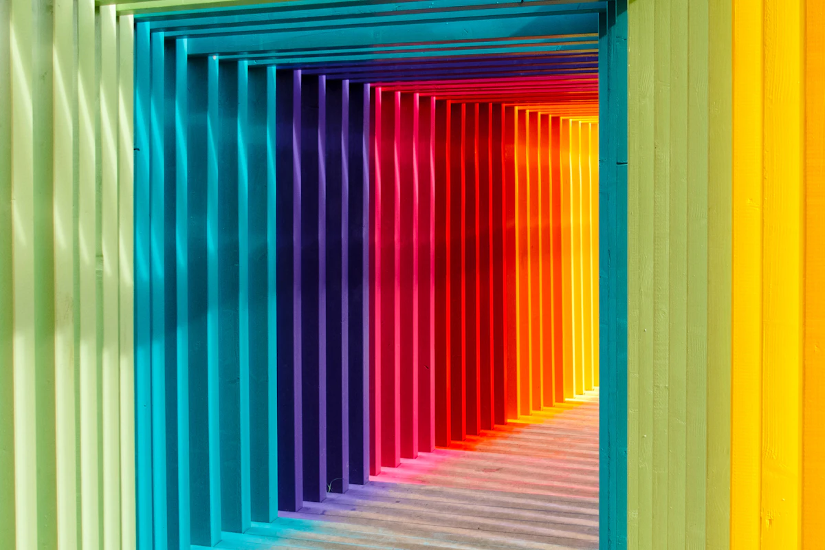
The secret to successful monochromatic design lies in understanding how to manipulate a single hue. If we simply use the exact same hex code for everything, the design will feel flat and uninspired. To master chromatic layering, we must balance three key variations: Tints, Shades, and Tones. By adjusting the lightness and saturation, we create "layers" that the eye perceives as depth and shadow, giving life to a two-dimensional space.Tints and Shades: Creating Natural Light
Tints are created by adding white to a color, while shades are created by adding black. In a chromatic layering strategy, tints act as highlights, drawing the viewer's eye to specific points of interest. Shades, on the other hand, provide grounding and weight. Think of a deep navy blue background paired with sky blue accents; the contrast isn't between different colors, but between different "volumes" of the same color energy. This creates a natural hierarchy that feels incredibly stable and professional.Tones and Saturation: Adding Sophistication
Tones are created by adding grey to a hue. This is where true mastery begins. Highly saturated colors can be exhausting to look at for long periods. By introducing muted tones within your palette, you create "breathing room." Layering a vibrant emerald green over a muted, dusty sage green creates a sophisticated look that feels modern and curated. It’s about the conversation between the intense and the subtle.Texture as a Layering Tool
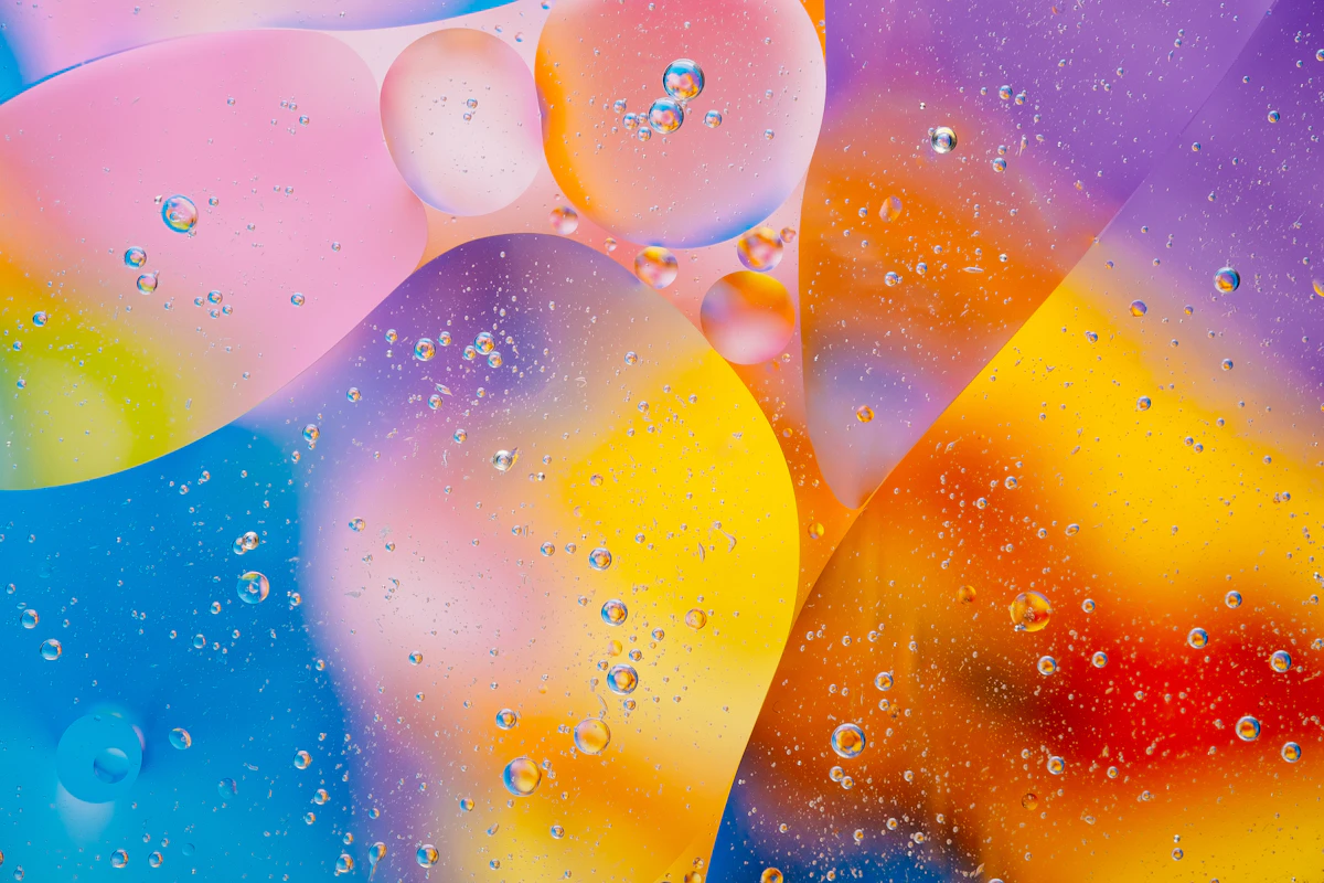
When working with a single color, texture becomes your best friend. In the physical world, a silk blue ribbon looks different from a blue wool sweater, even if they share the exact same hue. In digital and visual design, we replicate this by using gradients, grain, and opacity. By changing how light "interacts" with the surface of your color, you add a tactile dimension that makes the monochromatic palette feel rich and expensive. You can experiment with these concepts using tools like Adobe Color to see how monochromatic harmonies can be expanded with subtle variations.The Role of Transparency and Opacity
One of the most effective ways to layer is through transparency. By stacking semi-transparent layers of the same color, you naturally create new shades where the layers overlap. This mimics the way light behaves in nature, such as looking through clear water or layers of glass. This technique is particularly powerful in modern UI design and digital illustration, where it creates a sense of "glassmorphism" and airy depth.Why Chromatic Layering Works
Chromatic layering is more than just an aesthetic choice; it’s a psychological tool. By staying within one color family, you reduce the cognitive load on the viewer. The brain doesn't have to process the relationship between different colors, allowing it to focus more deeply on the content, the form, and the emotion of the piece. It creates an immediate sense of harmony and intentionality that feels luxurious and calm.Strategic Application of Layers
To effectively implement these ideas, you need a plan. It’s not just about picking five random blues; it’s about choosing where each "depth" belongs. A common mistake is making everything too similar, which leads to a lack of accessibility and readability. Below is a guide on how to distribute your chromatic layers for maximum impact.| Layer Type | Visual Function | Recommended Use |
|---|---|---|
| Primary Shade | Foundation & Stability | Backgrounds, Large surfaces |
| High-Light Tint | Attention & Focus | Call-to-action, Highlights |
| Muted Tone | Transition & Balance | Secondary text, Supporting elements |
| Deepest Shade | Definition & Border | Icons, Dividers, Sharp shadows |
Mastering the Subtle Balance
The most important thing to remember is that monochromatic doesn't mean boring. The most successful examples of chromatic layering are those that push the boundaries of a single hue. For instance, a "Grey" palette can range from the warmth of a pebble to the coolness of steel. By staying sensitive to these tiny shifts in temperature and tone, you can create a masterpiece that feels incredibly detailed despite its simple ingredients.If you're looking for inspiration, I highly recommend checking out Behance for portfolios that focus on "Monochromatic Branding." You will see how top-tier designers use these layers to build identities that are unforgettable. The next time you start a project, try challenging yourself to use only one color. You might be surprised at how much depth you can find when you stop looking for other colors and start looking deeper into the one you have.
In conclusion, mastering chromatic layering is about appreciating the nuances. It requires a keen eye for detail and a willingness to experiment with the invisible boundaries of a color. By focusing on tints, shades, tones, and textures, you can transform a simple palette into a profound visual journey. Start with a color you love, and see how many stories you can tell with it.
